
Or Thing-I-wish-I-knew-15-years ago #2
Written in June 2025.
As a UX researcher and qualitative researcher, I was forever trying to defend why observing even 5 people is beneficial, why design improvements matter, how usability contributes to the bottomline, etc. (I’m just fortunate to be working for a startup where the product leaders are design-mature, and I never needed to explain this to them in the past 4 years.)
Enter, my Operations Management class. (Thank you, Les!)
On Week 1, basically the intro week, I learned how to do a check-sheet.
(Let me also give a disclaimer, I’ve been doing feature prioritization based on discovery research since 2011, but I come from the IDEO-and-37-Signals school of product design, and not the W.E. Deming school of process analysis, though I am a fan.)
What are check-sheets?
Check sheets (should) form the foundation of functional process maps. And, the proper definition is that that list contains all the tasks customers care about*.
This lesson reminded me of how meticulously I used to document user tasks and job stories**. And, I loved it.
I also loved that this formed a basis for issue- or defect-prioritization.

How would I apply this?
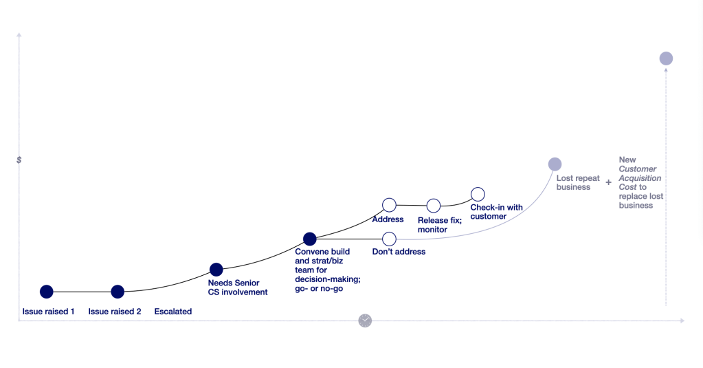
If you can identify that there’s a certain threshold or class of customer complaints that leads to churn, you can infer the resulting opportunity cost of the cause:
- At some point, you gain the evidence to determine that after, say, 3 complaints (or 2 failed attempts at looking for something; or waiting for ~20 seconds***), a customer will start to churn. It can be behavioural churn, meaning they just stop coming back.
- You can use the ratio above to calculate the cost of sustained usage (Acquisition Cost / 5 = Satisfaction Cost versus the total “Dissatisfaction cost”).
- Say, you’ve lost the customer – and if that’s a paying B2B customer, let’s say the impact is $1,000 per month.
- This especially hurts for B2B, but y’ know what, for niche B2C, this is pretty hard, too. Now you have to deploy resources to recover that lost $12,000 annual, and likely wait 3-9 months for the sales cycle to bear fruit.
- Not including the cost of customer support and appeasing an irate customer, and possible downstream resources needed for issue resolution (e.g. developer time, product manager, senior CX/CS person, design time, QA, project manager/ scrum master).
- …When you could have just invested in catching quality issues early and fixing that feature.
In my qualitative research life, we had a concept called “hygiene factors” (a topic for another time), but basically the way this was drilled into how I work was that the then-VP of my research department would ask me: “But, would they stop watching?” each time I submitted a synthesis of factors or pain points.
“So if they fix that, will it make people come back?” report-after-report…
Going back to the original topic.
I wish I learned this quantification years ago, because it was always a challenge to explain the ROI of usability or design improvement.
I’ve had to pull people into usability tests, so that they – IT, Legal, Product, Design people – would realize we need to change something. Maybe putting a dollar amount would have been faster, and better suited for leadership-level proposals. (Though, at least they also built empathy and had an actual appreciation of the user experience, through watching in-person usability tests 🙂 )
I’ve also been part of teams where we developed and released glaring errors, and – although, that’s natural and human – there was no clear or expressed cost around the customer support it would take to recover the customer impact of those errors.
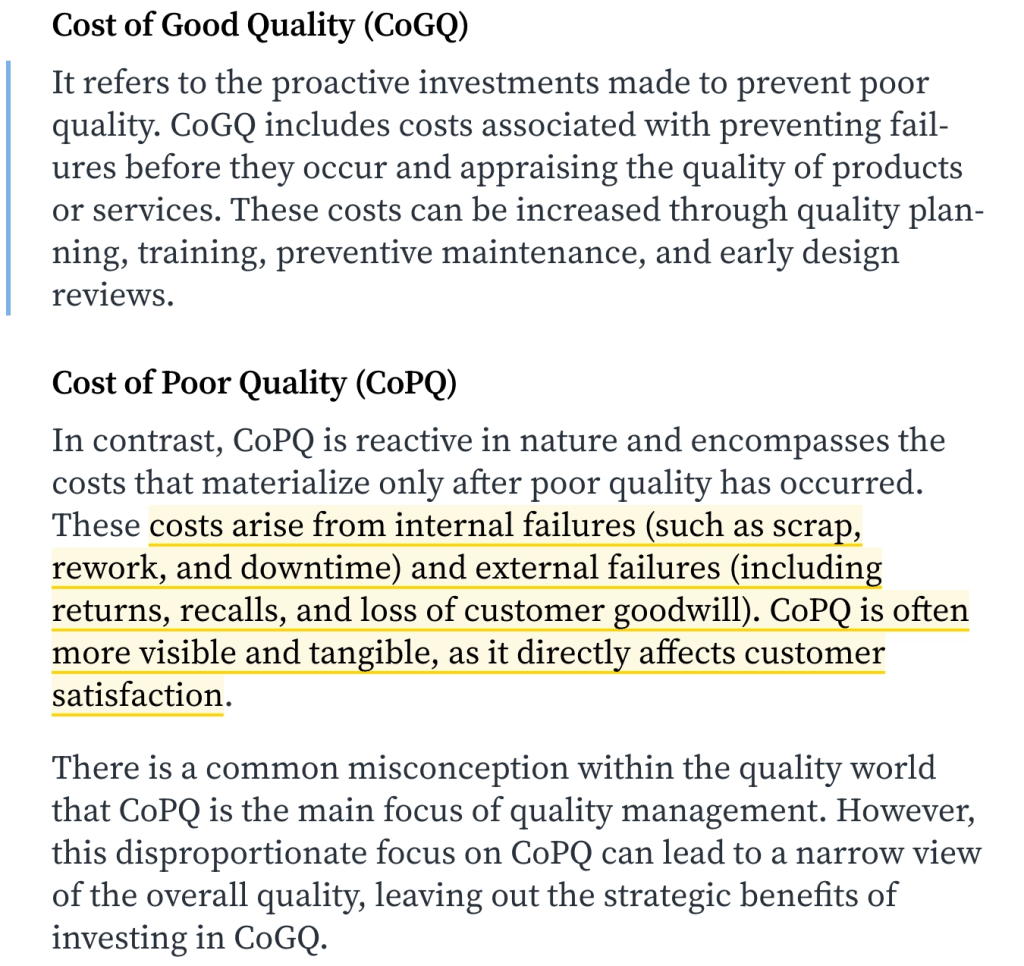
I loved the check sheet and Cost of Quality lesson because it gave a labelled process to the discovery-and-priotization approach that I do, even if it came from an adjacent or different field.
I did do Pareto analysis (I mean, this was THE most effective way to filter through 40+ user stories), but I didn’t realize there was a standard way to do it in Excel 😆
All this to say – thanks, Les. And, thanks to the Operations Management book we used, for teaching this human-centered-design dog, new quality management tricks.
* This is also similar to Gerry McGovern’s Top Tasks identification (which I do an abridged version of, since the total survey process is…intense).
** This is one of the “-cons” of getting more mature or tenured, right? At some point, things become second nature and you can forget to articulate the rigor to yourself.
- A third of why I even took the program that I did at BCIT is because I realized that I needed to get a good grasp of Operations Management, if I wanted to continue down the path of service design.
- I also happen to like working for “boring” systems. Hence, my last two jobs were at a bank (where I was most excited to digitize branch and HR systems) and freight (where I work on process automation for accounting and operations teams). Whee!
*** I’m thankful that I’ve been part of building and “sustaining” many digital products over time, so I get to see broad patterns. Numbers mentioned here are approximate examples based on experience.
Originally posted on Ghost as Cost of Quality.


Leave a comment