Pros, cons, and favourites.
Originally posted on Ghost as 10 Versions of UX Research Documentation. Written in January 2022, as a work reflection.
In the past 10-15 years, I’ve also probably tried around 10-15 different forms of UX research documentation and dissemination. Here’s a rundown of what worked and didn’t.
In order of what-I-keep-coming-back-to:
1. The product-planning debrief
Made for: Small product-focused working teams — that value action and nuance over formal reporting.
In other words, this needs a research-mature team: that understands how to connect observed behavior, to needs, to priorities, to feasibility – and when to think of which.
Bad for: Future-proofing.
What I’d do better: Detailed minutes.
- Notes + Miro/ Post-its + Wireframing -> only understandable to the people present
I can also call it: Top 3 takeaways
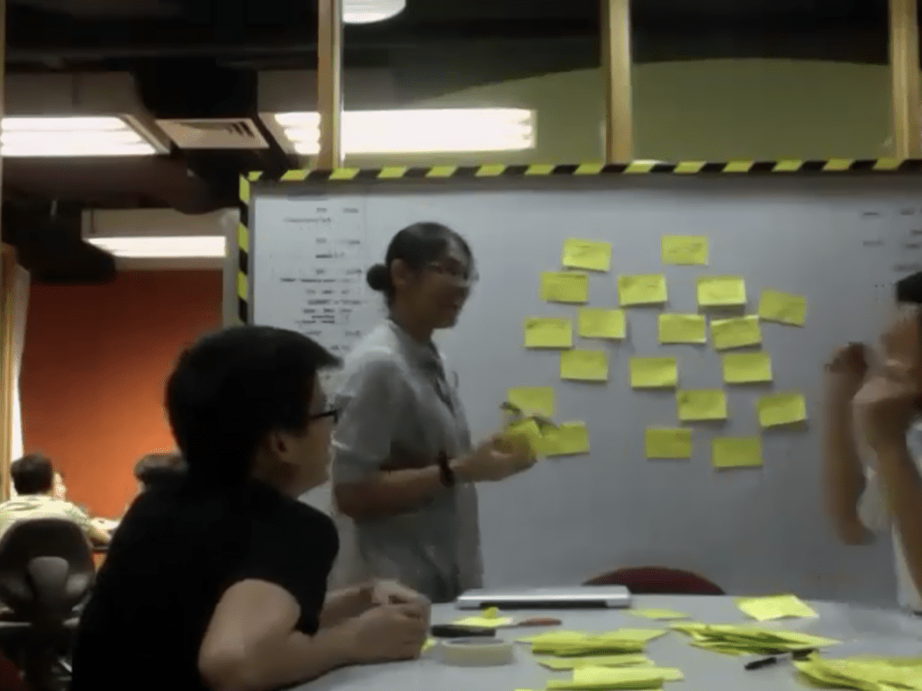
Since, it’s most often a debrief that I run after small usability tests (5-10 users; 5-10 tasks each) – where the team gets together and contributes/ writes down their observations. (Example of this process: Featured image of this post)
2. The customer journey mapping session
What I use most often as a failsafe for discovery research, particularly related to (digital) service improvement (which has been my work for the past decade).
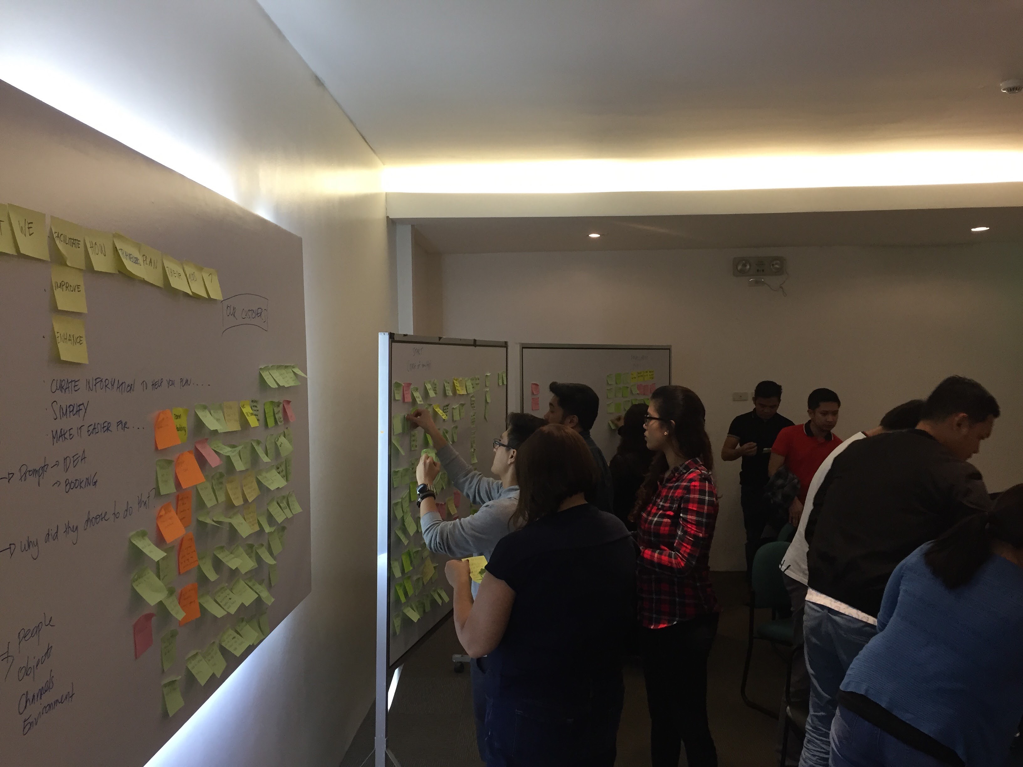
This hits the key information you need ->
- which touchpoints when,
- what info is important,
- what decisions are being made,
- what sub-actions are being done.
It’s the fastest route to knowing what needs to be fixed.
Not fit for non-discovery phases. So, if the team’s in evaluative method mode, then don’t do this.
Also, this takes a bit of research (i.e. time).
3a and 3b. The full-blown usability results “table”
I have at least 2 forms of this table (depending on my teammates’/audience’s need for detail).
Primarily, it’s a summary of the key test differentiators.
A. One version I have is a high-level summary – that shows either aggregated task success rate, or average completion time for – various tasks, screen sizes, competing products tested, demographics or technographics – depending on the goal of the test.
B. This is more straightforward – just a summary table of the same (task success, completion time or pain points) per participant (with profile/description).
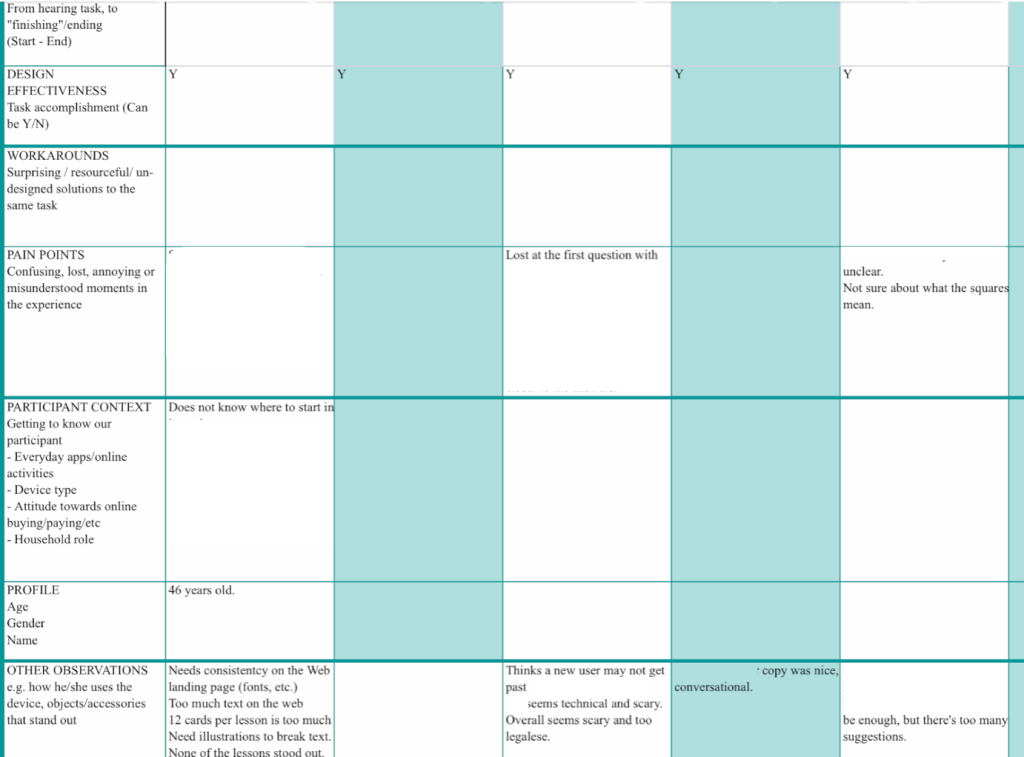
Obviously, I mainly use these for usability testing. Summaries this direct don’t apply to discovery research (unless forced to. Which I also experienced once in my life).
4. Monthly User-data-from-different-channels summary (triangulation)
This one I love, but keep forgetting – only routinely did once/at one job. I attempted to implement at another team, but failed at doing it collaboratively/scaling it so that others could apply.
I summarize key learnings from: Product analytics, Internal company information/imperative, Ad hoc/Qualitative research and social media/customer service feedback.
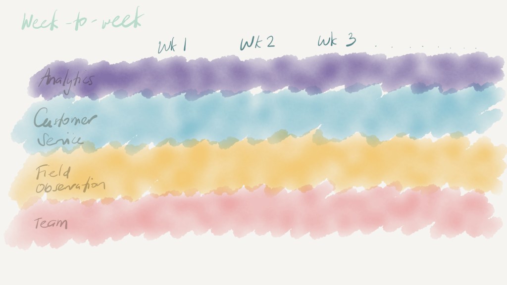
This is connected to product plans/feature changes, and sent out to the team. I love what this represents – connecting multiple streams of customer findings to org plans.
Cons:
- This is already quite processed, so has hidden pre-work/data clean-up, that isn’t visible or apparent in the final output.
- Monthly is actually not “frequent” enough for most cases, but this was the sustainable pace, for me (we were in a very lean team).
I think if I was able to systematize this, it would be awesome.
5. Key Drivers analysis
I realize that my brain defaults to this for qual – and for good reason. I think it’s still a remnant from my market research days – where the foundational piece of information was choice drivers.
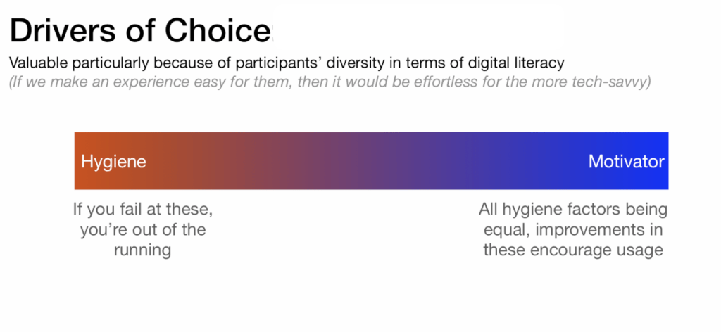
What this has: Hygiene factors VS Differentiators
I love making this analysis, because the analysis steps are so fun. The final outcome is rewarding, too.
Obviously, only applies to discovery research – anything whose goal is determining preference “why would someone buy/choose/use”.
Cons:
- There needs to be “thick enough” data to make this analysis – and you can only do this using data from in-depth interviews/actual detailed conversations on why people do what they do. It can’t be inferred.
6. Pure artifacts and images + stories = Story-sharing
This is actually my favorite – if I could do it all the time.
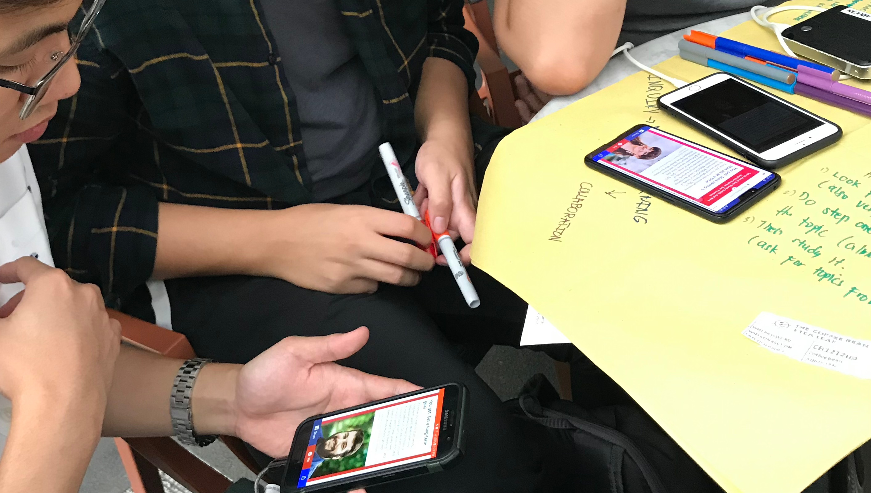
It takes a team that is open-minded, or at the very least aware of the value of qualitative information.
i.e. This does not work for teams and individuals hard-wired to value numbers.
Also in other words, you really can’t use it all the time – unless you are/have a good evangelist.
Back to the Pro’s:
- This is really it, for me. The epitome of the value of observational, behavioral design research. Seeing “the how” and the nuance.
- Great for “innovation” – finding the unspoken, intuitive considerations people have when they do something. It isn’t something you can always explain.
- The other “information” you get from it is “three-dimensional awareness, or contextual awareness – it’s a different type of imagination boost. Which is really the spark you need for solving problems creatively or sharply.
7. The full report
I don’t particularly enjoy this, but every long-term job of mine has had this at some point.
Ingredients: background and methodology, rundown of answers to all the goals of the study: can be behavioral archetypes, drivers, a journey and conclusion.
Essentially, it’s a long document describing who the userbase is (based on the participants), motivations, options and decision factors, lifestyle, service or user experience and recommendations or implications.
Pro: Comprehensiveness
Con:
- I have never made one in faster than 10 working days – due to the data processing and clean-up work, analysis and actual writing and report-crafting (models, etc.) phase.
- Time + makes research seem like a static artifact.
8. The database: “Atomic” research repository
You know, I want this to work. I really do. I know this is supposed to be THE way.
9. Key quotes per theme/ finding

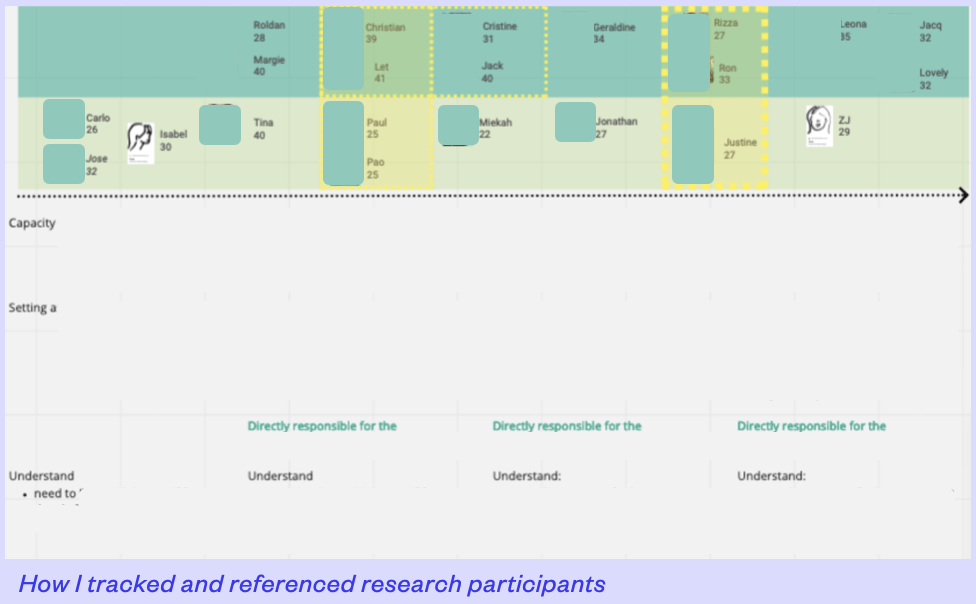
10. The “navigation bar” summary with participant photos
Quite involved; not sure how applicable this is to any discovery research project. Lends itself well to research goals around “scales” or gradients.
Additional entry: The one-pager format: Created by my design research team member Vikki.
This was a handy summary (most would probably say it’s an executive summary). [I do not have an excerpt of this, as this was my friend’s output.]
Bonus round: Least favorite format ⬇️
11. Persona document
Among the ~5 times I’ve done “personas” as a research output (and I usually try to follow Indi Young’s “Thinking Styles”, as well as the original Cooper process for personas), the format I found most impactful was the first (very detailed, by-the-book). [Don’t have a copy of that anymore, I believe.]
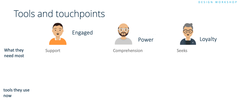
This image below was, instead, from the latest research cycle where I used personas. The presentation favoured a more concise description, but I did go in-depth for the needs discussion. The brief descriptions were better fit for this project, because there were very few participants (even for a qualitative research cycle).
 ao
ao 
Leave a comment